Movies With The Best Soccer Team Logos
Soccer movies have always been a part of the fictional world of movies. Over the years, we have seen so many classics, blockbusters starring big names, and the adaptation of the bestselling novels. They made us happy, sad, and overwhelmed with so many emotions through characters and storylines. And indeed, they inspired us with different messages and concepts while keeping us entertained – even we wished these fictional teams existed in reality so we can root for them and be a part of their inspiring journey. Speaking of which, we decided to have a creative discussion and take a closer look at the aesthetics of our favorite soccer teams in the movies.
In this blog, we will discuss the aesthetic custom soccer jerseys and logos of teams that gained immense popularity and have some of the best designs we fell in love with. If you’re into soccer and love watching such movies, or are a logo designer looking for inspiration, then stick with us till the end as we’re about to reveal incredible details. So without further ado, let’s get started.
Escape To Victory
The iconic movie dates back to the ’80s and depicts the story of the allied war prisoners that play soccer matches against the German Team. Starring Sylvester Stallone, Michael Caine, and professional soccer players – Bobby Moore, Paul Van Himst, Osvaldo Ardilles – the movie was a big hit and is still popular today.
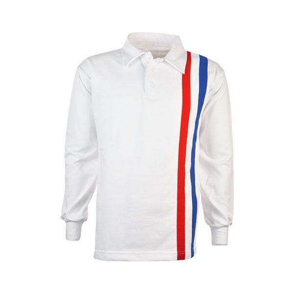
Despite their strong storyline, fascinating characters, and direction, their minimalistic yet attractive team logo also made headlines. Breaking down its arrangement and color combination, it goes without saying that design is everything to take inspiration from. In that time period, the prisoner teams didn’t have a defined logo on their uniforms, but the Allies Prisoners emblematic logo still has a glorious place when it comes to the best soccer movies.
In the logo, there are three bold colored lines on one side of the white jersey, and the powerful combination of blue, white, and red depict courage, freedom, and the incredible players who win against all odds. In a nutshell, the simplistic logo gives off the concept of winning beyond the soccer games, having self-belief, and not succumbing to tyrannical powers that try to put you down. In addition, its aesthetics and eccentricity remain unmatched till today.
Ladybugs


Released in 1992, the sports comedy stole our hearts with the interesting plot and the lovely characters. Starring Rodney Danger, the movie keeps you hooked from the beginning to end. It’s about the common businessman who decides to take over a girls’ soccer team which his company sponsors. The story unfolds in an interesting way and there are so many plot twists. And of course, the logo of the soccer team got the coveted spotlight due to its cute yet simple design and arrangement. It’s the embodiment of clarity, femininity, and the right color palette.
The logo contains the image of the football with the cute ladybug sitting on top of it, while the word ladybug outlines the image on the bottom. The arrangement is so geometrically pleasing that it doesn’t go unnoticed. In addition, the color combination of red, black, and white gives off the bold and powerful effect in the logo – just right for the girls’ soccer team. The logo and the uniform got so popular they became a design inspiration for many youth uniforms at that time, and kids just wanted to buy custom soccer jerseys similar to it.
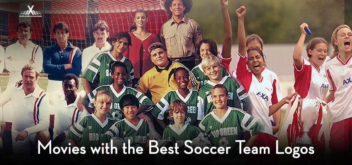
The Big Green
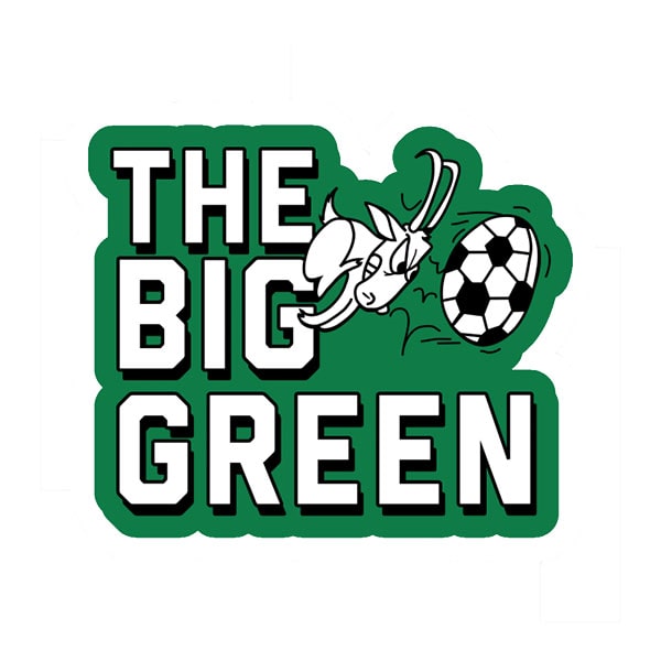
The iconic movie was released in 1995 and tells the inspiring story of a teacher that takes over an underperforming youth soccer team and helps them achieve huge success. It’s all about hard work, strategy, and having a strong belief in one’s self. And of course, its green uniform and logo were a major highlight. The design and arrangement of the logo don’t go unnoticed in the uniform as it shows a horned goat hitting a ball while the team’s name is placed right beside it in bold letters. The black and white colors look pretty against the green stripes and background. It won’t be wrong to say the uniform and logo didn’t just look nice on the big screens but played a major role in promoting the movie as well.
Bend It Like Beckham
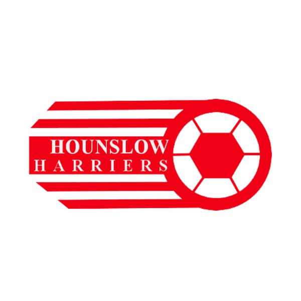
Popular comedy-sports, ‘Bend it like Beckham’ took the movie scene by storm back in 2002. Starring Keira Knightley, Parminder Nagra, and Jonathan Rhys Meyers, the movie tells a heart-touching story of a girl who wants to play football despite her parents forbidding her. After a huge struggle, she ends up joining Hounslow Harriers which ends up winning the league.
Let’s talk about the Hounslow Harrier logo over here which got the spotlight as well. The logo shows off the geometrically pleasing arrangement of shapes and lines on the white background. It contains the image of the football that appears to be speeding forward and has the team name placed on the side of it. There’s only red color in the logo depicting fierce passion and power that goes so well with the concept of the movie too. And in addition, it looks fantastic against the white background.
That was all from our side, we hope you gained interesting insight about the fictional soccer teams and their logos through this blog. With the new releases on different mediums, we’ll bring more reviews and design analysis in the future for sure.
Stay updated on sports news, uniforms, and more with AthleisureX.